By using this website, you agree to our privacy policy
×Diary of an Apprentice Letter Carver -Week Two
Monday 10th April 2017
Fergus has said on a few occasions that there is no such thing as a straight line in lettering. While uprights may look straight, it actually has a thing that letter carvers describe as ‘entasis’. Entasis is most commonly used to describe the way tapering stone columns bulge out slightly in order to correct the visual illusion of concavity had the column been made with just the taper. When the term is applied to letter carving, it takes on a broader meaning, because what letter carvers employ to counteract any optical illusions is actually - in the strictest sense of the meaning - reverse entasis. The letter carver has to make his or her letter ever so slightly concave in order to give the appearance that the line is straight. If the line was actually straight, it would look like it had a bulge – and therefore the opposite problem to that of the Greeks when they were designing their columns.
On Saturday, I practised drawing out some C and D’s on paper. I must get used to being light with the pencil. It may not matter so much now, but when I come to draw my letters out on slate, the pencil tip will evaporate under the sort of pressure I’m applying to the paper. When Fergus is drawing out letters on paper, he draws so lightly that it’s hard to see them. I’ve had to lean in closer need to lean in to see them…and I’ve got pretty good eyes! That’s the kind of lightness he’s looking for.
I spent the rest of today practising D, E and F. It’s sometimes hard to see subtle differences in the thick and thin strokes of a letter. Fergus will draw a letter and I will draw it out several times until I know I’m close to his example. Placing the same letters next to each other really helps develop one’s eye for detail. You can see quite easily how your letter has improved and spot those very minor improvements through its evolution. Training the eye to see that next level of detail is a key skill in becoming a proficient letter carver.

Tuesday 11th April 2017
One thing that Fergus keeps noticing in my drawn letterforms is that I’ve not quite cracked the entasis in the uprights. So while Fergus was out fixing a headstone, I used a whole line of an A3 piece of paper to practice about twenty letter I’s. It took all of the morning to do, but it’s very important to develop that skill. To give the upright letters (B, D, E, F, H, I etc.) an almost imperceptible waist in their vertical features is crucial. Without this entasis, the letter would just look wrong. It definitely improves the look of them, adding both energy and the necessary inward curves to correct that visual illusion of a straight letter.
After the upright practice, I continued with my alphabet. I focused on the G, H and J. I enjoyed drawing the G. The G is an example of a letter whose curve is thicker than a normal thick and whose thin is thinner than a normal thin. It’s hard to get those thicknesses not just right, but also in the right place. The H is also a tricky one to get right because your eye automatically makes a comparison between the two uprights as they’re so close to each other. As such, extra special care needs to be taken to get these identical twins to identically match. Both of my H’s were far too flared at the bottom and top, so when Fergus got back from his fixing job, he said they were looking a bit seventies. Fergus has two workshop J’s, but uses the one whose tail has a subtle curve, which finishes below the line. It’s much more elegant than the conventional J. I can see why he prefers it.
Wednesday 12th April 2017
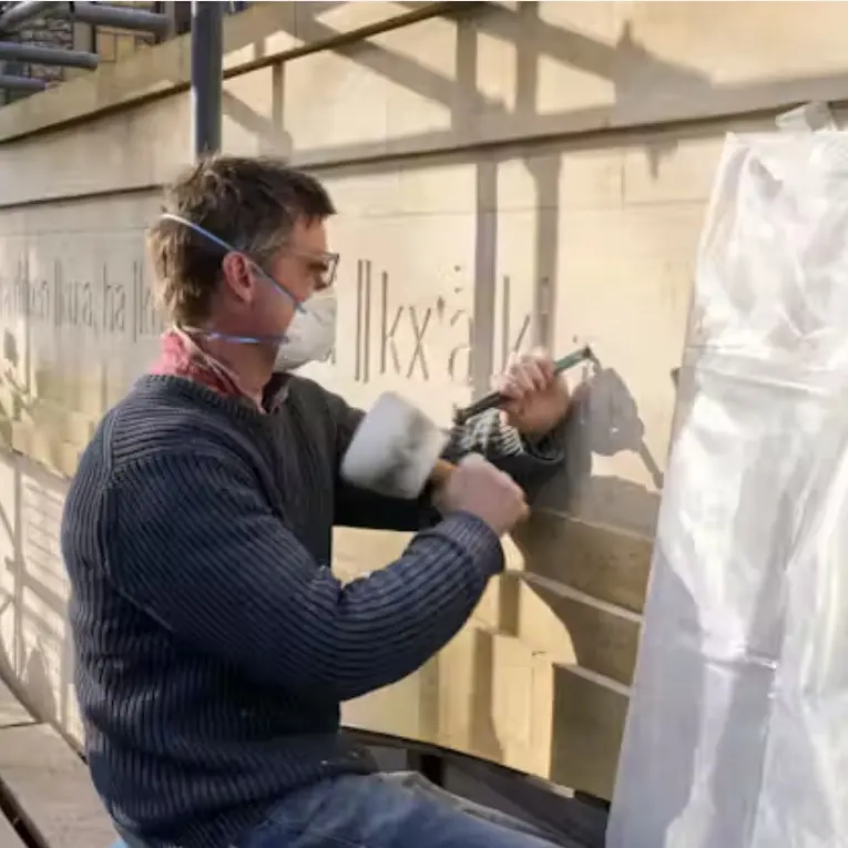
A day of carving today. I’m still not going slow enough – again, the mason’s curse of being told to speed up and hit harder for three and a half years. I think I’ve proven to Fergus that I’m a quick learner and that things learnt at masonry college can be unlearnt relatively quickly. That’s apparent in the serifs I’m carving: last week they were much too thick; now they’re the thickness Fergus was looking for. Sometimes I forget and my grip tightens and I get faster, but I know that default setting will disappear within another week. Fergus will tell me if I’m going too fast or gripping too tightly and I’m very lucky to get his advice and input so regularly. He told me he can tell through a letter carver’s work whether they’re self-taught or have come through an apprenticeship scheme. The quality of a letter carver who’s been through an intensive apprenticeship scheme like the Kindersley Workshop is clear in the work they produce. A self-taught letter carver has no way of accessing the 100+ years of accumulated knowledge that an apprenticeship scheme can offer. You cannot replicate the lineage of master-apprentice teaching that the most prestigious apprenticeships can offer. No one wants to be average, which is why I consider myself very lucky to be in this position.
Again, I need to keep reminding myself to nibble with the chisel from the centre when chasing. I’d messed up on an ‘I’ by cutting along the outside line too soon. It was a moment of weakness. A momentary lapse in concentration. I must have been distracted by a passing thought or something on the radio. I must remain focused!
At this stage, the most important thing is to get as much practice in my hands as possible. Although I trained as a stonemason, I find that I’m much better drawing letters than I am carving them. Fergus said that it’s more important to be a good drawer of letters at this stage because a good understanding of the letterforms will serve me much better as I develop my skills as a letter carver. He said that it’s a lot harder to teach someone to see a letter and draw it accurately than it is to teach them to carve letters.
After the ‘I’ disaster, I slowed right down again when I got to the C. It turned out relatively well. It seems a little easier than the E, which I went on to carving after that. I made the mistake of carving the upright first, and when Fergus saw, he apologised for not telling me to always do the horizontal thins first to minimise the risk of chipping when the vertical and horizontal elements of the letter meets.
Fergus cut me a new piece of slate this afternoon and drew out some letters for me to work on tomorrow morning. My current panel has become overcrowded. There’s no room to swing a C!
The most important thing I learnt today: don’t try and cut a letter straight after lunch! It’s best to do a little warm up exercise first to get back into that zone that’s so necessary when carving letters.
Thursday 13th April 2017
I must still remember to slow down! It’s a hard habit to break. Someone new to stone has the opposite problem. They’re often overcautious. Fergus said I put a lot of pressure on myself for someone who’s only just started letter carving. I just have to remember that Trajan’s Column wasn’t built in a day!
I didn’t take enough breaks today, which I think is why my carving went downhill by late afternoon. I will make sure I do some reading during my breaks so I take my mind away from carving for a little while. I’m dipping in and out of a great book at the moment. It’s A Companion to the English Parish Church by Stephen Friar. It’s an encyclopaedia of everything to do with parish churches that I bought from a car boot sale a few years ago. The author describes every architectural part of a church you can think of and it’s a great thing to browse through with a cup of tea and a hobnob. I don’t know whether it’s still in print, but it’s a good thing for anyone stone-mad to have.
Once you’ve carved your letters roughly to the pencil line, a competent letter carver will rub the lines out and carve the finishing touches by eye. It shows that the carver knows his letter, but it also requires him to have a good eye for wobbles and imperfections. He or she can spot a wobble here or a lean there and make the necessary adjustments. At one point this afternoon, I moved onto another letter ‘I’, but when Fergus came to check my progress, he told me to go back and iron out a few wobbles in the upright of the last ‘I’ that I did. So I went back and went some of the way towards making it an okay(-ish) letter. I had the most fun doing that. I’ve found that the more time and attention you give a letter, the more it’ll give back. Treat the letter right and it will treat you well in return. That’s when I came up with today’s rhyme:
The more you carve, the more you see…
until every little thing becomes a catastrophe!
As from tomorrow, I’m going back to the heavier dummy hammer. Using the lighter one has been good to use as a short-term fix, but Fergus doesn’t think it’ll do me any favours in the long term. Going back to the heavier dummy will teach me to strike the chisel really lightly, and it will help when I come to carve in harder material – something the lighter dummy would be useless on.
Friday 14th April 2017
These are some of the things I wrote down when Fergus was looking over my work: he said that I should avoid lined texture. If you can see prominent chisel marks after a chase, he said I’m gripping and hitting too hard. I should be pushing the chisel along the slate with the dummy rather than making significant cuts. No pressure on the stone should be applied. I also need to remember to make small taps, not to go too deep and keep the V-cut even.
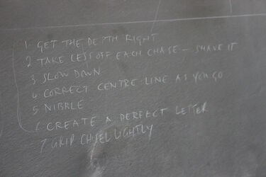
I was much more relaxed today and made sure I took three regular breaks. David Kindersley had said that a letter carver shouldn’t carve for more than two hours without a break. Breaks dramatically improve the letter carving experience.
I’m really enjoying refining my letters once the bulk of the work has been done. I’m starting to slow down as well.
I think it’s important to make the letters look beautiful at every stage of the process, not just at the end.
And I realised again that the more attentiveness and calmness and softness and slowness you show a letter, the more it will give you back. Treat it right, and it will treat you right.

Fergus Wessel
Designer and letter-carver
Fergus created Stoneletters Studio in 2003, after training at the Kindersley Workshop. He is a member of the prestigious Master Carver's Association.


Request our free booklet today
- © 2026 Stoneletters
- Legal notice
- Privacy policy
- Disclaimer
