By using this website, you agree to our privacy policy
×
Interview for I Love Typography
I was recently interviewed for I love typography, on the of leading typography blogs in the world.
I was recently interviewed for I love typography, one the of leading typography blogs in the world. The interview gives a fascinating insight into my work and my passion for typography. Click here to view the full article.
My work is firmly rooted in my love for typography, having grown up playing with type on the dirty floor of the Whittington Press.
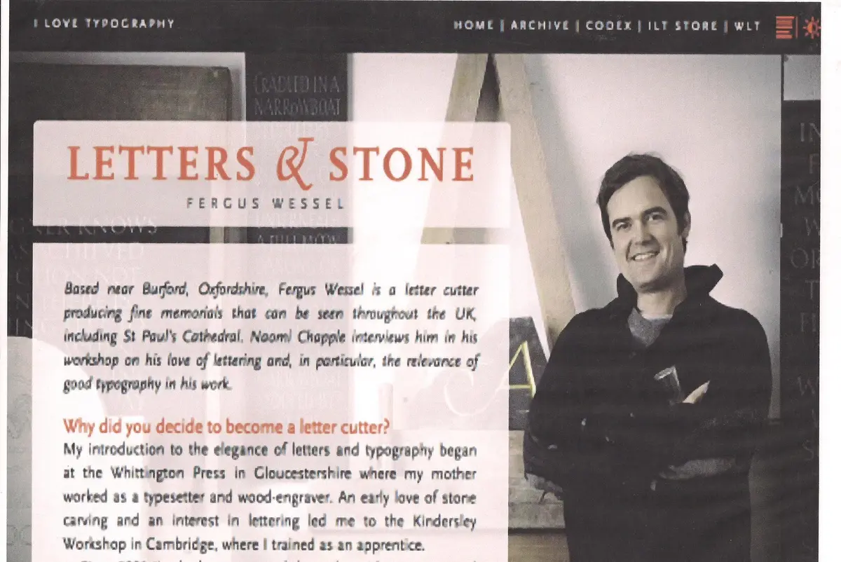
Why did you decide to become a letter cutter?
My introduction to the elegance of letters and typography began at the Whittington Press in Gloucestershire where my mother worked as a typesetter and wood-engraver. An early love of stone carving and interest in lettering led me to the Kindersley Workshop in Cambridge, where I trained as an apprentice.
Since 2003 I’ve had my own workshop where I have so enjoyed meeting people, working with them, and understanding their needs. My work tends to be quite traditional and my conviction is that finely carved lettering and pleasing spacing are fundamental; simplicity is the key.
Why a particular interest in good typography?
An inscription on paper or stone can be a beautiful thing to look at, a work of art. It is not the content that interests me most, but the shape and rhythm of the lettering. An inscription must be pleasing and well balanced to the eye. This requires an in-depth knowledge of sound typographic principles.

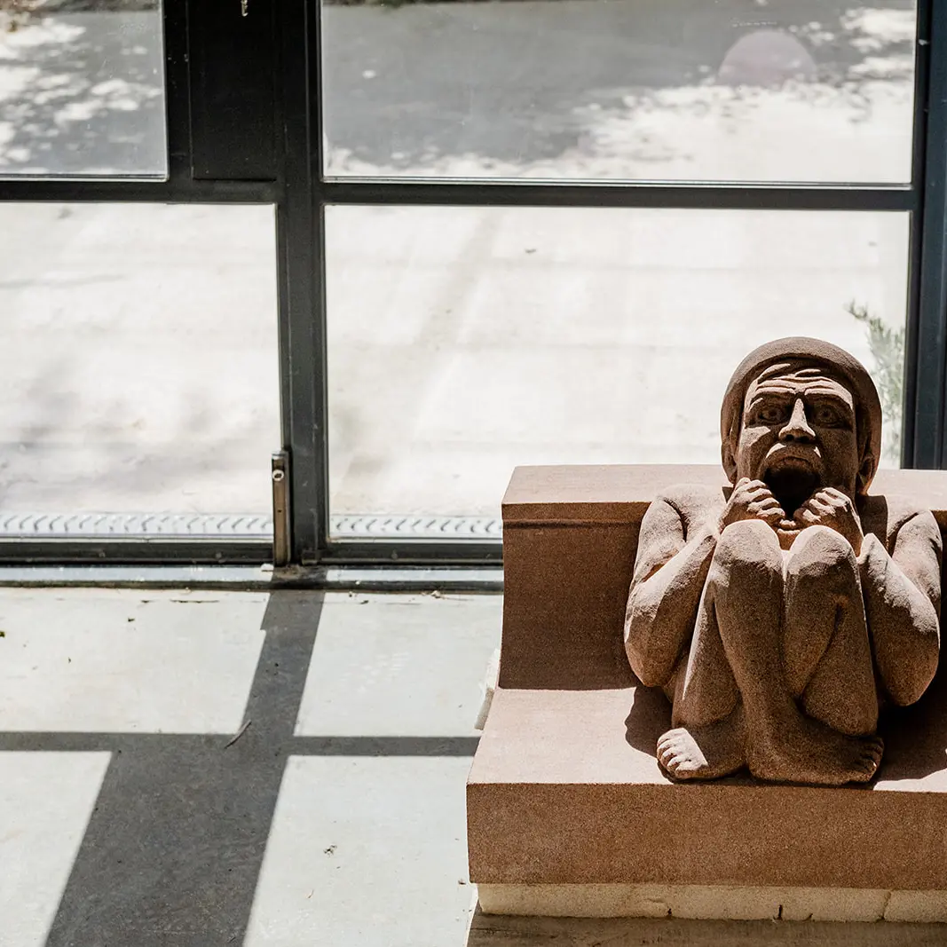
Rhythm in riven slate.
Your lettering is entirely hand-cut. Is typography more relevant and important in hand-carved lettering than in sandblasted lettering?
Unfortunately, it does have more relevance in hand-carved lettering, though it shouldn’t. There is no reason why sandblasted lettering can’t be well spaced and laid out. Sadly, however, there is a general lack of care and love with machine-cut lettering. Those who produce hand-carved lettering tend to take more time and give their work more love and attention. It’s not the technique that’s the problem, but the layout. This is more important than the way a letter is cut; for example, finely carved lettering with poor spacing and layout will still look awful.

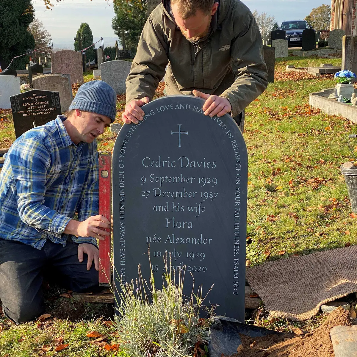
Left: Carving robust letters in relatively soft Portland stone. Right: This slate was carved by an apprentice as an exercise in good rhythm & spacing.
Do the principles of good typography on paper translate well to, say, headstones? How do you adapt a typeface for use in stone?
In order to achieve a good design on stone, the lettering needs to be adapted to the type of stone. For example, if one is carving in slate, there is little difference in the lettering one might use on paper. However, in limestone the letter needs to be chunkier and more deeply cut, as we rely on the shadow of the v-cut and not colour to see the letters.
What are the limitations of lettering in stone?
When cut by hand, lettering in stone has few limitations, unlike sandblasted lettering, which is restricted by the technology that produces it (although this is improving all the time). In many ways, with lettering in stone there is more flexibility than in type, where one is restricted by the piece of type. Again it depends on the material; a coarse and open limestone only really lends itself to big, bold lettering. Slate, on the other hand, is very fine to cut and one has complete control over the material — one’s chisel being like an extension of the hand.

Left: The beauty of slate is that it permits such fine carving. Right: An experiment using a type designed for paper on slate.
How do you achieve good letter spacing? Do you use a ruler?
By eye, I never use a ruler! With a ruler, one is limited to set measurements and sometimes a letter needs to be moved “by a nothing.” I judge good letter-spacing by visualizing an equal volume between letters. This skill is achieved by having the patience to start drawing out an inscription all over again if it doesn’t look perfect. We call this “killing one’s darlings” and it takes a lot of self-discipline.
Are there any typefaces you particularly like using in stone?
I don’t really use typefaces in their pure form; they are mainly designed for paper, so, as a letter cutter, one has to adapt them or design one’s own based loosely on a typeface. For example, one of my favorites is the lowercase alphabet from Caslon; but I would only ever adapt this to slate, as the forms are quite delicate. While the letterform is carved by hand, each will be slightly different and will always be an interpretation of the type.
Do you have a favorite letter, and why?
It would probably be the “S”. I like the challenge involved in getting the balance between the top and bottom spaces just right. They should look the same to the eye, but if you ever turn an “S” upside-down you’ll see that it looks completely top-heavy. The bottom space must always be larger than the top to give the illusion of balance.
Do you give yourself much artistic license when laying out an inscription in stone?
Yes, of course; but this stage is incredibly disciplined, and it is a design issue, not one of free expression. It is not only about individual letter spacing but also about the interlinear spacing and the inscription as a whole. When marking out the lines on stone, I don’t use a ruler but a ticker. Again, this is because the distances involved are so precise that a ruler is simply not accurate enough.

Gilding an opening plaque in Welsh Slate.
What do you think of Eric Gill & his lettering? Has this tradition been lost to modern-day letter cutters?
Eric Gill is my hero! His lettering, in my opinion, remains unsurpassed, partly because of its honesty. We are all striving for perfection, but there really is no such thing of course. If we try to control it and attempt to be too artistic, we are in danger of losing that honesty. One has to let the letters flow a little.
There are certainly strict rules of good layout and lettering, but rules are there to be broken. But in order to bend the rules, one has to know them in the first place and attain that initial discipline. This requires years of experience and practice; it is something that evolves and it is during this evolution that you develop your own individual style and form.

Carving readable, chunky letters in Cotswold stone.
Do you consider lettering more challenging than relief carving or sculpture?
It is very different; there is no margin for error. If lettering is slightly wrong, the eye is immediately drawn to the problem. Poor spacing can break up a whole inscription; in fact, good letter spacing is more important than the individual letters themselves. There is a big difference between lettering that has been drawn out on stone and lettering that has been carved. If you draw out an inscription and then adhere rigidly to the lines, the spacing cannot be expected to be perfect. In order to achieve good letter spacing, I always work on a block of four to five letters at a time. If, when carving some letters, I see the spacing is not perfect, I adjust the width of the letters by a fraction; but this takes practice to see.
Which factors are most important when lettering in stone?
Patience above all! Balance, good layout, unity, and timelessness. I don’t like to follow fashions in lettering, as they don’t endure. Often, I believe, the simplest headstones are the best.

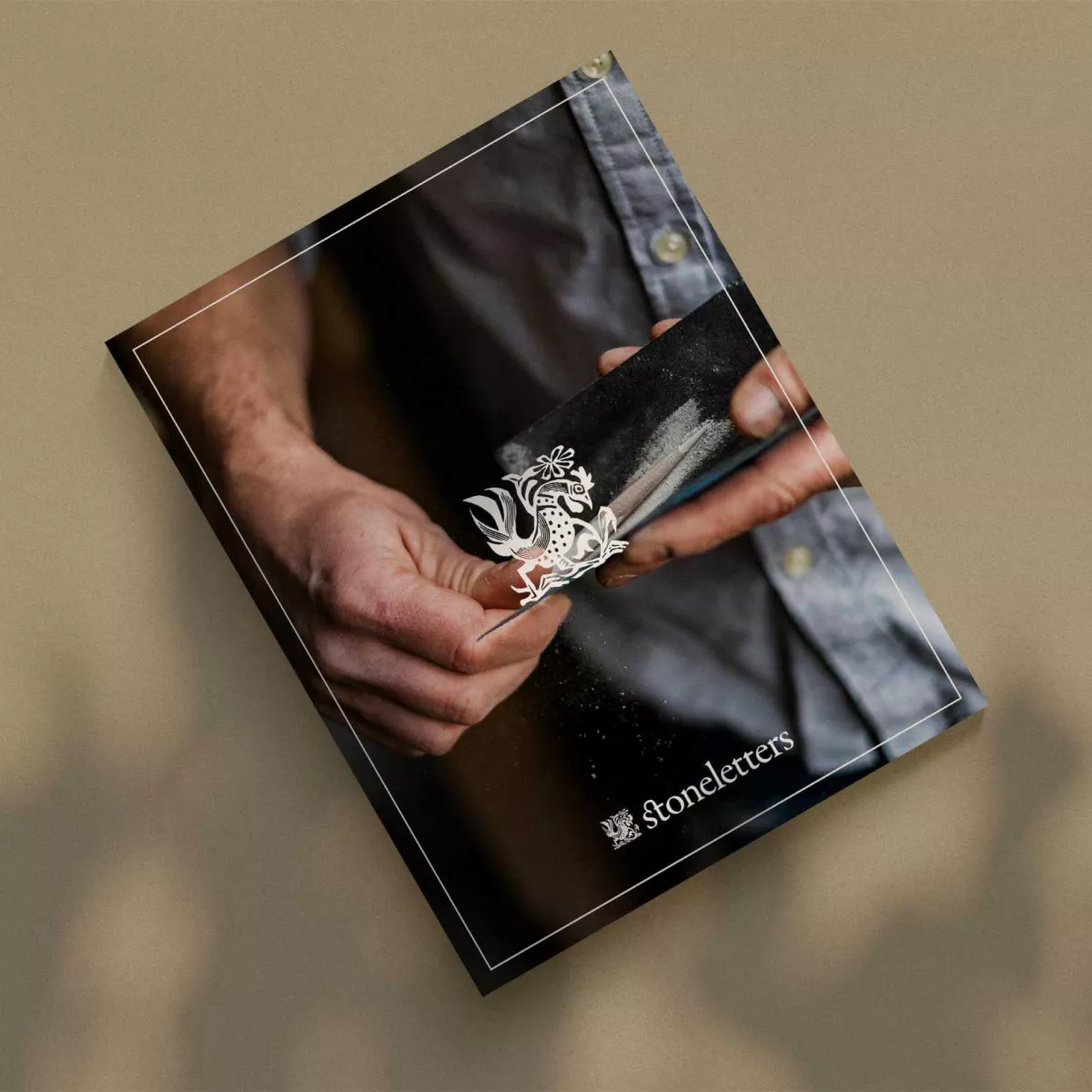
Fergus Wessel
Designer and letter-carver
Fergus created Stoneletters Studio in 2003, after training at the Kindersley Workshop. He is a member of the prestigious Master Carver's Association.


Request our free booklet today
- © 2026 Stoneletters
- Legal notice
- Privacy policy
- Disclaimer